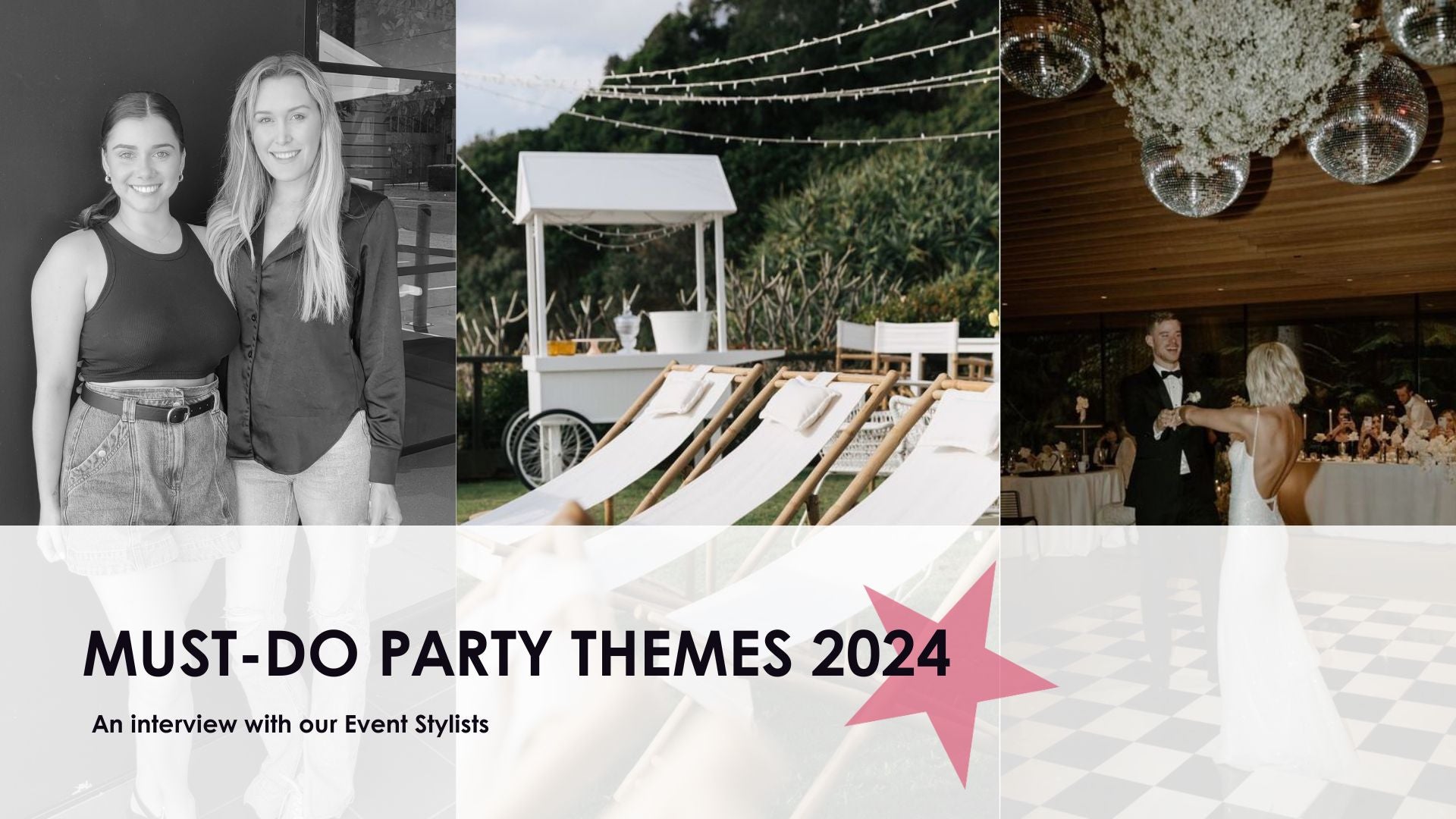

Peach Fuzz Paradise
Twenty twenty-four is on the horizon and Pantone has once again announced their Colour of the Year. Introducing Peach Fuzz!
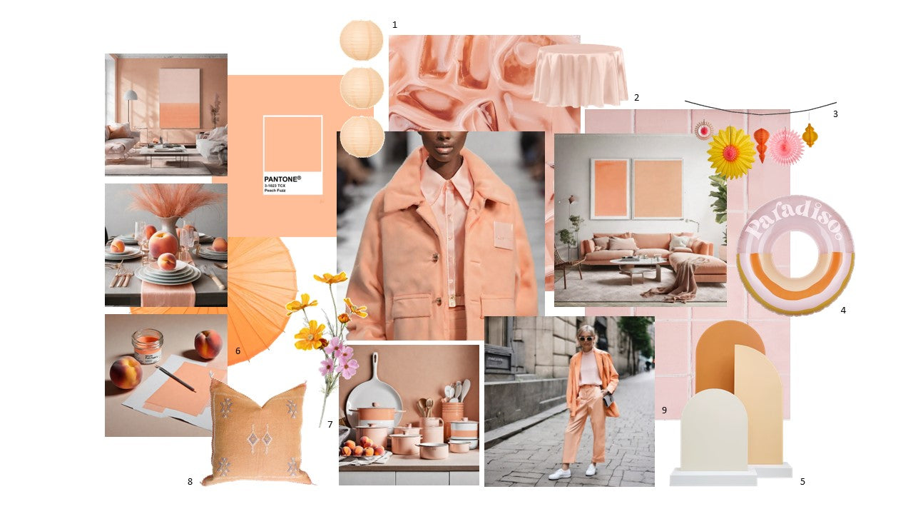
Pantone's Colour of the Year holds significant influence for setting the tone in various design industries, including event styling and visual merchandising. In recent years, we've seen a celebration of energy inducing tones that evoke optimism and whimsicality. From 2022’s dramatic Very Peri blue to Vivid Magenta in 2023, these two deep rooted tones vibrate with energy and expression.
Interestingly, the essence of peach fuzz contrasts from previous years, making it a refreshing choice with a softer tone to evoke tranquillity and warmth. This year's Pantone Colour of the Year, for instance, may draw inspiration from soft, inviting shades such as quartz pink and lemon yellow, working with organic textures and other colours found in nature.
The gentle warmth and subtle vibrancy of this natural hue mirrors the comforting and reassuring qualities often sought after in design. From textiles like table linens and drapery to floral arrangements and decorative accents, infusing the peach fuzz aesthetic creates a harmonious visual narrative. This fusion encapsulates the essence of modern design—balancing innovation with nature-inspired elegance.
By embracing Peach Fuzz as an extension of Pantone's Colour of the Year, event stylists, visual merchandisers and designers can create captivating, immersive environments that resonate with attendees on an emotional level. This natural, soft touch not only reflects current design trends but also stands the test of time as an enduring symbol of elegance and connection to nature.
The Prop House Collective has a catalogue of props available to create an imaginative and sensory experience. From lanterns to cactus silk cushions, satin table linen, cosmos flowers and backdrops will offer a tactile and comforting moment.
Peach Fuzz, with its organic allure, perfectly embodies this timeless appeal of nature’s gentle beauty.

Cool Matcha
Associated with energy, harmony and health, Cool Matcha’s serene attributes have nestled perfectly into the design trends of 2024/25. In contrast to the rich and creamy tones of mocha and espresso, the powdered hues of Matcha provide vitality and softness to any interior, table setting or graphic design.
The infamous tea-leafed antioxidant has found itself a staple in the shopping baskets of health-conscious consumers, contributing to $7.1 billion of the US food and drink market this year alone. From cookies to ice cream, macaroons to pancakes this pocket-rocket superfood is overtaking the consumer market in both food, drink, and the arts.
Originating from its ancient roots in China, this native hue perfectly complements the diverse textures and tones of bamboo, concrete, claypot and milk.
For your next dinner party, DIY a cluster of rattan chandeliers overhead for an intimate, Oriental-inspired setting. Garnish glassware with fresh citrus and mint, embellish the surrounds of tapered candles with wild moss, honeydew melon and elderflower. Hand-illustrate placenames and menu cards for a personal imperfect touch and capture special moments with a tonal backdrop – ignited with a glimmer of neon!
Where to use Cool Matcha: Decadent tablescapes, Visual Merchandising pods, bold signage

Retro Blue
Evoking freedom, imagination, loyalty and stability, Retro Blue’s characteristics are a melodic combination of space and strength. Innovatively blurring the lines between the natural world and modern-day digitalism, blue’s serene attributes offer a perfect base colour to embellish upon.
For a zesty, Spring/Summer outdoor activation, compliment with punchy hues of nectarine and grapefruit, or opt for a muted display with sister shades of cerulean and cornflower.
For product launches, long lunches, and Visual Merchandising activations, utilise vintage market carts or vintage vehicles with custom signage, overflowing refreshments and fresh florals.
Curved ottomans provide retro seating pods and towering arches lead the way to an unforgettable event!
Where to use Retro Blue: Baby showers, photo shoots, graphic design, and product launches!
Let’s create breathtaking experiences together in 2024. Contact our team 07 3555 8660 or email styling@theprophouse.com.au